Padd Solutions

Converted by Falcon Hive


I can't explain how much I love the French Connection ads by Fallon. By far my favourite campaign for a long, long time. The bags have the ads on too, I'm going to have to buy something just so I can have a bag to put my crap in.


Today Claire and I visited Manchester to try and get some motivation for our current briefs. We made our way over to Salford Quays so that we could visit the 'Art In Advertising' exhibition that is currently on at The Lowry.

The exhibition description says it would explore "the relationship between art and advertising", so what I thought the exhibition would be about was an in-depth look into why past advertisements from BJL were created, the inspiration behind them, the creative process, the idea, the history, and how it is influenced by art.

However, it was not like this. The exhibition is very much for the general public. People who have absolutely no knowledge of advertising. One display included an explanation of what a brief is and how it is tackled, together with some examples of scamps. This would no doubt be interesting for people who aren't in the advertising industry and don't know how an ad is put together, however it was not really something that we could learn anything from.

Some of the displays were quite vague and I couldn't really understand how they linked to advertising, such as an inflatable Earth (where you wrote on an Elastoplast what you wanted to make better about the world and stuck it on the globe) and a wooden stand with teacups on it. It reminded me of a Vis Com student project, and nothing like what I expected for a professional exhibition.

What confuses me most is that despite it being an exhibition which is definitely tailored towards the general public rather than creatives, they intend to hold workshops with creative teams throughout the course of the exhibition which would suggest that they expect advertising students to attend. It seems odd to have a workshop programme in place but then to have an exhibition which is tailored for people who aren't in the industry. You know?

The silver lining though is that we did get to speak to a creative team from BJL who told us of their experiences in the industry. They were busy sat at a table working on some of their briefs. They gave us some advice regarding putting together a book, what creative directors are wanting to see from students and how they find working in industry. We also got to look at some of their work, and the art director's book. It was really informative talking to them, which was probably worth the trip alone. Well, that and this:


All in all, the exhibition was disappointing as we expected it to provide more for students such as ourselves to learn from. The saving grace was speaking to the creative team who were able to fill in so many gaps that were left open by the exhibition itself.

------


'Cooking With Dog' is a series of YouTube videos from Japan. It is basically a cooking show which teaches you how to make Japanese cuisine whilst a Toy Poodle called Francis sits in the background.


I have two favourite things about the show:

1. How little the dog is featured in the videos; and
2. The possibility of misunderstanding the title 'Cooking With Dog'.

Keep a close eye on how uneasy the dog becomes throughout the show but is forced to stay perched on the stool. Poor Francis.

A new advert from the Shreddies 'Knitting Nanas' campaign by McCann Erickson London.


I love that there are new "episodes" now, it's become almost like a mini-soap with distinctive characters that are developing over time.
Hedi Slimane's portraits are always stunning, so when I found out he was going to be doing the photoshoot for Lady GaGa's 'The Fame Monster' album I almost wet myself with excitement.

These are the results, which are beautiful. I especially love the gold one with metal bodyplate. Scary/gorgeous.

-----

www.hedislimane.com

I posted this as part of my Contextual Studies work but also wanted to post it here as I really love it. A viral by a mystery musician for an upcoming album. Who could it be?

My bet is on Christina Aguilera. The girl looks like her and the music sounds like Goldfrapp/Ladytron - both of whom she has worked with on her new album. LOVE IT.

Though this is clearly a very polished piece of film (ignoring the owl clip), this would have worked just as well on a lower budget. Virals are an amazing way of getting people talking, especially when you leave them guessing about what the source is.


This is absolutely glorious. The ink process is by no means new, but applying it to something completely unrelated is genius. I love when people are able to make these little inventions.


"Ink Calendar" make use the timed pace of the ink spreading on the paper to indicate time.

The ink is absorbed slowly, and the numbers in the calendar are "printed" daily. One a day, they are filled with ink until the end of the month. A calendar self-updated, which enhances the perception of time passing and not only signaling it.

The ink colors are based on a spectrum, which relate to a “color temperature scale”, each month having a color related to our perception of the whether on that month. The colors range from dark blue in December to, three shades of green in spring or oranges, red in the summer.

The scale for measuring the “color temperature” that I have used is a standard called ‘D65’ and corresponds roughly to a midday sun in Western / Northern Europe.

The "Ink Calendar" was developed for “Gradual “, an exhibition featuring works, which were evolving during the exhibition time at the London Design Festival 2007.

------


If you haven't seen this before, make sure you watch it right until the end.

Top marks Leopard Slug, top marks.


Oh hi!

We've gone and got ourselves a team blog.

You can find it here: http://helloroi.blogspot.com/

We have just uploaded some "behind-the-scenes" pictures from our Nature's Pleasure photoshoot with the second year photography students. Pretty snazzy.

When did I start saying snazzy? I sound like my mum. Next I'll be telling people they're trendy.


Frrrrrrppt.

Less than 24 hours before the photoshoot for the house book and I want to make last minute changes to the concept. Ever the professional.

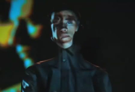
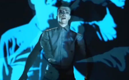
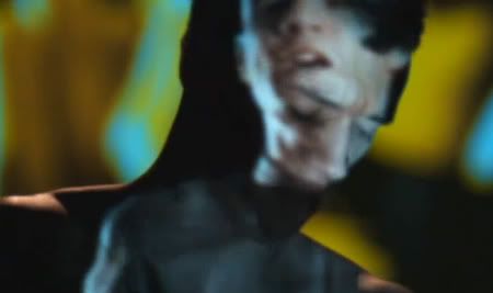
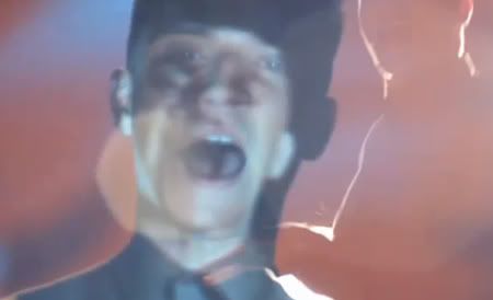
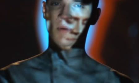
Taking inspiration from the music video for 'Better Off As Two' by Frankmusik (Vincent Frank). Vincent stands still in a darkened room whilst a projection of himself dancing is projected upon him. This creates some interesting patterns and lights, and is similar to an effect I want to try in the photoshoot.

As established at the beginning of this brief, we are a brand new team but we want to project a certain image to the agencies - I want to literally project this image.

Using acetate I want to take several photographs/patterns and project them onto a backdrop in the photography studio. We will then stand in front of this projection so that part of the design cascades upon ourselves, but the majority projects on the backdrop.

I'm not sure how this will turn out, but in my head it looks interesting. We will have to see how things go on the day, and tweak it as appropriate.

------

Stills from 'Better Off As Two':


------

Projections for the photoshoot:


These pictures won't make sense to anybody, but I know what I'm doing.

TRUST ME.


Interesting website for when creative block strikes.


Before reading week, we came up with the name 'House of Roi' as our creative team name. We identified that we don't have that much in terms of work, and creating this identity makes us seem much more established. Stolen from Claire's blog, here is what she had to say:
Grown from a dot over an i. Our temporary (hopefully it will stick!) team name is House of Roi.

Who is Roi? Roi is your neighbour, he is warm, unoffensive, he is the guy who helps your Dad fix the roof. He takes two sugars in his tea. But Roi has brains, Roi measures how effectively the business uses its capital to generate profit; the higher the ROI, the better. If you use Roi. You will seek rewards.

The House makes us seem like an established design team, working in harmony.
We are contacting the agencies as soon as possible. We are currently researching and strategising how we will do this. I find what Claire wrote in the first sentence above interesting - "Grown from a dot over an i." It brings to mind the ideas of evolution and creation, which is what advertising is all about really, isn't it?

I have to admit we got a bit carried away with the creative side and have neglected the strategy, but we will fix this. We need to get an endline sorted, which hopefully we will do tomorrow during class.

The List

20:07 • • 0 comments


Oh blog, I have neglected you.

Here is what I am referring to as The List. Eight agencies that we want to be best friends with.

Bartle Bogle Hegarty (BBH)
As previously mentioned in an earlier post, responsible for the current campaign for Tango who have increased the size of their drinks and so, launched with a campaign about the effects of the increase in Tango. A brilliant creative and visually striking campaign. They are also responsible for the current British Airways campaign.

They seem to have a certain artistic style, particularly in their television adverts. They tend to be quite retro styled (greens, mustards, browns) and though incredibly slick, also maintain a certain lo-fi quality to them. I am a massive champion of lo-fi films, photography, art etc, so they really appeal to me.

Fallon
As gushed about in previous post.

Leo Burnett / www.leoburnett.com
Their client list just extends on and on. They stick in my mind for their innovative website, a design where I haven't seen anything else like it. Also, excitingly, based in Chicago. Why not try for an agency half way across the world? They might be just as excited to hear from Blighty as we are to contact them.

Mother
Whenever I talk about Mother, I start the sentence with a long sigh and a dreamy look into the distance. Just everything about them inspires me, I even get excited about the fact their website has multi-coloured tartan on it. I just want to be there, NOW. Most recently, creating a musical extravaganza for Coca-Cola in the form of adverts and an interactive website. My number one.

Ogilvy & Mather
Basically writing the rules of creativity (literally - I'm currently reading David Ogilvy's Confessions book.) Their reputation is probably the only thing that exceeds their work. They recently did an advert for American Express where they were able to cast Tina Fey and Martin Scorsese to star in it. I adore Tina Fey, and Martin Scorsese - a legend. Why wouldn't I want to be associated with an agency who has that kind of pulling power?!

Also, they've worked with Louis Vuitton. Free bags? Yes please. (I jest.) (No, really, give me a bag.)

(The ad for American Express is here - http://www.ogilvy.com/#/The-Work/Galleries/American-Express-Marty-and-Tina.aspx )

Saatchi & Saatchi
A strange one to call. For every good advert they have (Creme Egg, Cadbury Clusters) they have a really irritating one (T-Mobile, Oil of Olay). When they get it right though, they really get it right.

TBWA
TBWA have offices in both the North and South. Though I want to go to London, I am tempted to start more locally. In the first year we worked with Karla and Kayleigh who were our mentors for The Book brief and I know that they had quite a length placement at TBWA, so links have already been made with our college and the agency. It might be worth contacting them and doing some namedropping.

(Also responsible for the absolute worst yet best song lyric in the last year - from the Muller Corner advert. I'VE GOT MY BLUEBERRIEEEEEEEEES!!!)

Wieden + Kennedy
From looking at their portfolio, this is probably one of Davey Boy's favourite agencies. Responsible for the Honda 'Hate Something, Change Something' campaign and also many other campaigns that seem to echo Dave's teachings (the Lurpak campaign echoes his drill/hole/shelf methods). Also a favourite of Claire's - definitely one to look at.

-----

The first agency we are targeting is obviously Fallon - our favourite from the off. I want to also try and find some agencies in Leeds, as none of the agencies listed above are based here. Keep it local!

In the last few weeks, I've seen a few adverts that have really impressed me and each time I have thought "That was great - who made that?" and I trot off to the Internet and every time it's the same agency - Mother.

Have you seen the new adverts for Rocky biscuits?


Fox's marketing director Mike Driver said: ‘We conducted research that showed biscuits can be risky. Last year there were 513 biscuit-related injuries.' He claimed these ranged from a man getting bitten by a squirrel while feeding it a biscuit to people burning their fingers when fishing out soggy biscuits from mugs. *

Obviously, Mother are an agency that everybody wants to work with, and I'm pretty sure that 90% of our class are going to try and get in touch with Mother for a brief. Can we turn that into a positive somehow?

------


* Quote from Lucky Red.


I have just spent two hours fiddling around with this site. Call me superficial, but I couldn't spend the next five months looking at a blog that looks like 1992.

For the purposes of this brief, it might be helpful to know I am working with Claire and Vanessa.

So far, we have only thought about approaching one particular agency, and that is Fallon.

I had never heard of Fallon before starting this brief and happened upon their website when I was researching who made some of my favourite adverts. One of my favourite adverts from the last few years, just for the sheer joy it brought into my life, is the advert for Double Velvet toilet tissue. BEHOLD:

Click here to watch it.

How brilliant is that? I mean, it's not that clever and it's not a cinematic masterpiece, but it's funny and original.

Anyway, I digress. This is the advert that lead me to find Fallon.
Fallon are responsible for some amazing adverts from the past few years. Aside from the toilet toddler, they created the Cadbury's 'Gorilla', Sony Bravia's 'Balls' and many others. Their advertising is fresh, original and exciting.

I will admit, I got a bit carried away with my quest to get in contact with Fallon and I have obsessed over this one agency. We need to come up with a list of other potential agencies that we would like to contact as we may not even get a reply from Fallon, and then I would become manic depressive and spend evenings rocking myself to sleep, muttering the name "Fallon" over and over. That's not a good look for anybody, ask Britney.

Just off of the top of my head, a couple of other agencies that I admire are Mother and BBH - the latter being responsible for a recent Tango poster campaign, a poster from which is shown below:


Amazing.

The agencies that I find myself drawn towards are the ones that don't take themselves too seriously. Their work is modern and full of humour and make me wish that I'd been the one who created them. Those are the places I want to be associated with.

In the next post I'll explain what we've done so far to approach Fallon for a brief, but I have to go have a bath now. Too much information? Probably.

------

x